ShopDreamUp AI ArtDreamUp
Deviation Actions

Literature Text
I've made the following codes with  and hope maybe some of you could use these on other websites (maybe Core Members can use them in their journal designs, who knows) or at least you find them interesting.
filter works with Google Chrome 53.0, Internet Explorer 13.0, Edge, Mozilla Firefox 35.0, Safari 9.1, Opera 40.0, and newer
-webkit-filter adds support for Google Chrome 18.0, Safari 6.0, Opera 15.0, and newer.
You can click here to test out the recoloring with different images and Youtube videos by clicking on buttons that I provide, or allow you to insert whatever you want to test the effects on instead.
(the video I chose to include there has barely any views... hope this helps the person receive more)
(image links have to end with .png .gif .jpg and so forth)
Also, for your information, the CSS goes into < style > which is located in < head >
and the class goes in < img class="CLASS HERE" src="LINK TO IMAGE" >
(without the spaces after < and before >)
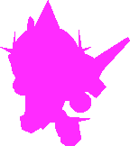
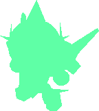
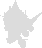
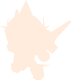
You can technically use the following codes to play "Who's that Pokémon?", but only on transparent backgrounds, otherwise it's just going to be a box.
The colors are a little soft (instead of perfect black, it's a bit brighter) because I wanted them to be.
If you want to make a list of sharp / perfect HEX colors, go ahead!
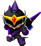
Unaltered
(Or should I say... unALTAIRed!... It's okay if you don't get the joke.)
Black

HTML class: black flat
CSS:
.black.flat{
filter:invert(.5)brightness(.4);
-webkit-filter:invert(.5)brightness(.4)
}
Blue

HTML class: blue flat
CSS:
.blue.flat{
filter:invert(.5)sepia(1)hue-rotate(201deg)saturate(39);
-webkit-filter:invert(.5)sepia(1)hue-rotate(201deg)saturate(39)
}
Bronze

HTML class: bronze flat
CSS:
.bronze.flat{
filter:invert(.5)sepia(1)hue-rotate(335deg)saturate(1.6);
-webkit-filter:invert(.5)sepia(1)hue-rotate(335deg)saturate(1.6)
}
Brown

HTML class: brown flat
CSS:
.brown.flat{
filter:invert(.5)sepia(1)hue-rotate(353deg)brightness(.7)saturate(2);
-webkit-filter:invert(.5)sepia(1)hue-rotate(353deg)brightness(.7)saturate(2)
}
Chrome

HTML class: chrome flat
CSS:
.chrome.flat{
filter:invert(.5)sepia(1)hue-rotate(200deg));
-webkit-filter:invert(.5)sepia(1)hue-rotate(200deg))
}
Cyan

HTML class: cyan flat
CSS:
.cyan.flat{
filter:invert(.5)sepia(1)hue-rotate(130deg)brightness(2)saturate(9);
-webkit-filter:invert(.5)sepia(1)hue-rotate(130deg)brightness(2)saturate(9)
}
Gold

HTML class: gold flat
CSS:
.gold.flat{
filter:invert(.5)sepia(1)hue-rotate(10deg)brightness(1.2)saturate(4);
-webkit-filter:invert(.5)sepia(1)hue-rotate(10deg)brightness(1.2)saturate(4)
}
Grass

HTML class: grass flat
CSS:
.grass.flat{
filter:invert(.5)sepia(1)hue-rotate(28deg)brightness(1.4)saturate(5);
-webkit-filter:invert(.5)sepia(1)hue-rotate(28deg)brightness(1.4)saturate(5)
}
Gray

HTML class: gray flat
CSS:
.gray.flat{
filter:invert(.5)brightness(1.2);
-webkit-filter:invert(.5)brightness(1.2)
}
Green

HTML class: green flat
CSS:
.green.flat{
filter:invert(.5)sepia(1)hue-rotate(71deg)brightness(.9)saturate(3.1);
-webkit-filter:invert(.5)sepia(1)hue-rotate(71deg)brightness(.9)saturate(3.1)
}
Indigo

HTML class: indigo flat
CSS:
.indigo.flat{
filter:invert(.5)sepia(1)hue-rotate(215deg)brightness(.7)saturate(3);
-webkit-filter:invert(.5)sepia(1)hue-rotate(215deg)brightness(.7)saturate(3)
}
Lime

HTML class: lime flat
CSS:
.lime.flat{
filter:invert(.5)sepia(1)hue-rotate(71deg)brightness(1.6)saturate(5);
-webkit-filter:invert(.5)sepia(1)hue-rotate(71deg)brightness(1.6)saturate(5)
}
Magenta
HTML class: magenta flat
CSS:
.magenta.flat{
filter:invert(.5)sepia(1)hue-rotate(265deg)saturate(9);
-webkit-filter:invert(.5)sepia(1)hue-rotate(265deg)saturate(9)
}
Maroon

HTML class: maroon flat
CSS:
.maroon.flat{
filter:invert(.5)sepia(1)hue-rotate(311deg)saturate(5)brightness(.6);
-webkit-filter:invert(.5)sepia(1)hue-rotate(311deg)saturate(5)brightness(.6)
}
Mint
HTML class: mint flat
CSS:
.mint.flat{
filter:invert(.5)sepia(1)hue-rotate(85deg)saturate(3)brightness(1.8);
-webkit-filter:invert(.5)sepia(1)hue-rotate(85deg)saturate(3)brightness(1.8)
}
Navi

HTML class: navi flat
CSS:
.navi.flat{
filter:invert(.5)sepia(1)hue-rotate(201deg)saturate(20)brightness(.6);
-webkit-filter:invert(.5)sepia(1)hue-rotate(201deg)saturate(20)brightness(.6)
}
Orange

HTML class: orange flat
CSS:
.orange.flat{
filter:invert(.5)sepia(1)hue-rotate(334deg)saturate(5)brightness(1.4);
-webkit-filter:invert(.5)sepia(1)hue-rotate(334deg)saturate(5)brightness(1.4)
}
Pink

HTML class: pink flat
CSS:
.pink.flat{
filter:invert(.5)sepia(1)hue-rotate(260deg)saturate(1.1)brightness(1.33);
-webkit-filter:invert(.5)sepia(1)hue-rotate(260deg)saturate(1.1)brightness(1.33)
}
Platinum

HTML class: platinum flat
CSS:
.platinum.flat{
filter:invert(.5)sepia(1)hue-rotate(10deg)brightness(1.5)saturate(1)grayscale(.8);
-webkit-filter:invert(.5)sepia(1)hue-rotate(10deg)brightness(1.5)saturate(1)grayscale(.8)
}
Purple

HTML class: purple flat
CSS:
.purple.flat{
filter:invert(.5)sepia(1)hue-rotate(235deg)saturate(7)brightness(.6);
-webkit-filter:invert(.5)sepia(1)hue-rotate(235deg)saturate(7)brightness(.6)
}
Red

HTML class: red flat
CSS:
.red.flat{
filter:invert(.5)sepia(1)hue-rotate(311deg)saturate(10);
-webkit-filter:invert(.5)sepia(1)hue-rotate(311deg)saturate(10)
}
Silver
HTML class: silver flat
CSS:
.silver.flat{
filter:invert(.5)brightness(1.73);
-webkit-filter:invert(.5)brightness(1.73)
}
Skin
HTML class: skin flat
CSS:
.skin.flat{
filter:invert(.5)sepia(1)hue-rotate(318deg)brightness(1.65)saturate(2);
-webkit-filter:invert(.5)sepia(1)hue-rotate(318deg)brightness(1.65)saturate(2)
}
Teal

HTML class: teal flat
CSS:
.teal.flat{
filter:invert(.5)sepia(1)hue-rotate(130deg)brightness(.85)saturate(2.5);
-webkit-filter:invert(.5)sepia(1)hue-rotate(130deg)brightness(.85)saturate(2.5)
}
White
HTML class: white flat
CSS:
.white.flat{
filter:invert(.5)brightness(2);
-webkit-filter:invert(.5)brightness(2)
}
Yellow

HTML class: yellow flat
CSS:
.yellow.flat{
filter:invert(.5)sepia(1)hue-rotate(10deg)saturate(3.4)brightness(2);
-webkit-filter:invert(.5)sepia(1)hue-rotate(10deg)saturate(3.4)brightness(2)
}
Don't try it on videos or square images without transparency, otherwise you'll get this:

(the example above is just a screenshot, it won't play if you clicked on it unless it was the real deal, which you can find here)
If you have more to suggest, or like to comment on this, please do!
and hope maybe some of you could use these on other websites (maybe Core Members can use them in their journal designs, who knows) or at least you find them interesting.filter works with Google Chrome 53.0, Internet Explorer 13.0, Edge, Mozilla Firefox 35.0, Safari 9.1, Opera 40.0, and newer
-webkit-filter adds support for Google Chrome 18.0, Safari 6.0, Opera 15.0, and newer.
You can click here to test out the recoloring with different images and Youtube videos by clicking on buttons that I provide, or allow you to insert whatever you want to test the effects on instead.
(the video I chose to include there has barely any views... hope this helps the person receive more)
(image links have to end with .png .gif .jpg and so forth)
Also, for your information, the CSS goes into < style > which is located in < head >
and the class goes in < img class="CLASS HERE" src="LINK TO IMAGE" >
(without the spaces after < and before >)
You can technically use the following codes to play "Who's that Pokémon?", but only on transparent backgrounds, otherwise it's just going to be a box.
The colors are a little soft (instead of perfect black, it's a bit brighter) because I wanted them to be.
If you want to make a list of sharp / perfect HEX colors, go ahead!
Unaltered
(Or should I say... unALTAIRed!... It's okay if you don't get the joke.)
Black
HTML class: black flat
CSS:
.black.flat{
filter:invert(.5)brightness(.4);
-webkit-filter:invert(.5)brightness(.4)
}
Blue
HTML class: blue flat
CSS:
.blue.flat{
filter:invert(.5)sepia(1)hue-rotate(201deg)saturate(39);
-webkit-filter:invert(.5)sepia(1)hue-rotate(201deg)saturate(39)
}
Bronze
HTML class: bronze flat
CSS:
.bronze.flat{
filter:invert(.5)sepia(1)hue-rotate(335deg)saturate(1.6);
-webkit-filter:invert(.5)sepia(1)hue-rotate(335deg)saturate(1.6)
}
Brown
HTML class: brown flat
CSS:
.brown.flat{
filter:invert(.5)sepia(1)hue-rotate(353deg)brightness(.7)saturate(2);
-webkit-filter:invert(.5)sepia(1)hue-rotate(353deg)brightness(.7)saturate(2)
}
Chrome
HTML class: chrome flat
CSS:
.chrome.flat{
filter:invert(.5)sepia(1)hue-rotate(200deg));
-webkit-filter:invert(.5)sepia(1)hue-rotate(200deg))
}
Cyan
HTML class: cyan flat
CSS:
.cyan.flat{
filter:invert(.5)sepia(1)hue-rotate(130deg)brightness(2)saturate(9);
-webkit-filter:invert(.5)sepia(1)hue-rotate(130deg)brightness(2)saturate(9)
}
Gold
HTML class: gold flat
CSS:
.gold.flat{
filter:invert(.5)sepia(1)hue-rotate(10deg)brightness(1.2)saturate(4);
-webkit-filter:invert(.5)sepia(1)hue-rotate(10deg)brightness(1.2)saturate(4)
}
Grass
HTML class: grass flat
CSS:
.grass.flat{
filter:invert(.5)sepia(1)hue-rotate(28deg)brightness(1.4)saturate(5);
-webkit-filter:invert(.5)sepia(1)hue-rotate(28deg)brightness(1.4)saturate(5)
}
Gray
HTML class: gray flat
CSS:
.gray.flat{
filter:invert(.5)brightness(1.2);
-webkit-filter:invert(.5)brightness(1.2)
}
Green
HTML class: green flat
CSS:
.green.flat{
filter:invert(.5)sepia(1)hue-rotate(71deg)brightness(.9)saturate(3.1);
-webkit-filter:invert(.5)sepia(1)hue-rotate(71deg)brightness(.9)saturate(3.1)
}
Indigo
HTML class: indigo flat
CSS:
.indigo.flat{
filter:invert(.5)sepia(1)hue-rotate(215deg)brightness(.7)saturate(3);
-webkit-filter:invert(.5)sepia(1)hue-rotate(215deg)brightness(.7)saturate(3)
}
Lime
HTML class: lime flat
CSS:
.lime.flat{
filter:invert(.5)sepia(1)hue-rotate(71deg)brightness(1.6)saturate(5);
-webkit-filter:invert(.5)sepia(1)hue-rotate(71deg)brightness(1.6)saturate(5)
}
Magenta
HTML class: magenta flat
CSS:
.magenta.flat{
filter:invert(.5)sepia(1)hue-rotate(265deg)saturate(9);
-webkit-filter:invert(.5)sepia(1)hue-rotate(265deg)saturate(9)
}
Maroon
HTML class: maroon flat
CSS:
.maroon.flat{
filter:invert(.5)sepia(1)hue-rotate(311deg)saturate(5)brightness(.6);
-webkit-filter:invert(.5)sepia(1)hue-rotate(311deg)saturate(5)brightness(.6)
}
Mint
HTML class: mint flat
CSS:
.mint.flat{
filter:invert(.5)sepia(1)hue-rotate(85deg)saturate(3)brightness(1.8);
-webkit-filter:invert(.5)sepia(1)hue-rotate(85deg)saturate(3)brightness(1.8)
}
Navi
HTML class: navi flat
CSS:
.navi.flat{
filter:invert(.5)sepia(1)hue-rotate(201deg)saturate(20)brightness(.6);
-webkit-filter:invert(.5)sepia(1)hue-rotate(201deg)saturate(20)brightness(.6)
}
Orange
HTML class: orange flat
CSS:
.orange.flat{
filter:invert(.5)sepia(1)hue-rotate(334deg)saturate(5)brightness(1.4);
-webkit-filter:invert(.5)sepia(1)hue-rotate(334deg)saturate(5)brightness(1.4)
}
Pink
HTML class: pink flat
CSS:
.pink.flat{
filter:invert(.5)sepia(1)hue-rotate(260deg)saturate(1.1)brightness(1.33);
-webkit-filter:invert(.5)sepia(1)hue-rotate(260deg)saturate(1.1)brightness(1.33)
}
Platinum
HTML class: platinum flat
CSS:
.platinum.flat{
filter:invert(.5)sepia(1)hue-rotate(10deg)brightness(1.5)saturate(1)grayscale(.8);
-webkit-filter:invert(.5)sepia(1)hue-rotate(10deg)brightness(1.5)saturate(1)grayscale(.8)
}
Purple
HTML class: purple flat
CSS:
.purple.flat{
filter:invert(.5)sepia(1)hue-rotate(235deg)saturate(7)brightness(.6);
-webkit-filter:invert(.5)sepia(1)hue-rotate(235deg)saturate(7)brightness(.6)
}
Red
HTML class: red flat
CSS:
.red.flat{
filter:invert(.5)sepia(1)hue-rotate(311deg)saturate(10);
-webkit-filter:invert(.5)sepia(1)hue-rotate(311deg)saturate(10)
}
Silver
HTML class: silver flat
CSS:
.silver.flat{
filter:invert(.5)brightness(1.73);
-webkit-filter:invert(.5)brightness(1.73)
}
Skin
HTML class: skin flat
CSS:
.skin.flat{
filter:invert(.5)sepia(1)hue-rotate(318deg)brightness(1.65)saturate(2);
-webkit-filter:invert(.5)sepia(1)hue-rotate(318deg)brightness(1.65)saturate(2)
}
Teal
HTML class: teal flat
CSS:
.teal.flat{
filter:invert(.5)sepia(1)hue-rotate(130deg)brightness(.85)saturate(2.5);
-webkit-filter:invert(.5)sepia(1)hue-rotate(130deg)brightness(.85)saturate(2.5)
}
White
HTML class: white flat
CSS:
.white.flat{
filter:invert(.5)brightness(2);
-webkit-filter:invert(.5)brightness(2)
}
Yellow
HTML class: yellow flat
CSS:
.yellow.flat{
filter:invert(.5)sepia(1)hue-rotate(10deg)saturate(3.4)brightness(2);
-webkit-filter:invert(.5)sepia(1)hue-rotate(10deg)saturate(3.4)brightness(2)
}
Don't try it on videos or square images without transparency, otherwise you'll get this:
(the example above is just a screenshot, it won't play if you clicked on it unless it was the real deal, which you can find here)
If you have more to suggest, or like to comment on this, please do!


Thanks to filter:invert(.5)sepia(1) I was able to make the recoloring and silhouette effect work!
How it works is that when you invert 100%, you have the opposite colors. So black would become white, blue become yellow, etc.
However, 50% is in the middle, which turns every single think gray. Adding sepia to it make the whole thing in sepia tone. You get the idea...
I used screenshots in this tutorial, but they were made in Mozilla Firefox, and I know they work in Google Chrome, so if some of them don't work in other browsers, let me know!
Suggestions for more colors or improvements are also welcome!
If this helped you or you're using some of these codes, I'd love to know!")
How it works is that when you invert 100%, you have the opposite colors. So black would become white, blue become yellow, etc.
However, 50% is in the middle, which turns every single think gray. Adding sepia to it make the whole thing in sepia tone. You get the idea...
I used screenshots in this tutorial, but they were made in Mozilla Firefox, and I know they work in Google Chrome, so if some of them don't work in other browsers, let me know!
Suggestions for more colors or improvements are also welcome!
If this helped you or you're using some of these codes, I'd love to know!
© 2017 - 2024 Merry255
Comments20
Join the community to add your comment. Already a deviant? Log In
I love the end result of these colorful shadows! I can't help but be reminded of the older Ipod commercials with these. ") And yeah, it would make for great guessing games like Who's That Pokemon!
And yeah, it would make for great guessing games like Who's That Pokemon! 
I can't help but be reminded of the older Ipod commercials with these. And yeah, it would make for great guessing games like Who's That Pokemon!